


Client
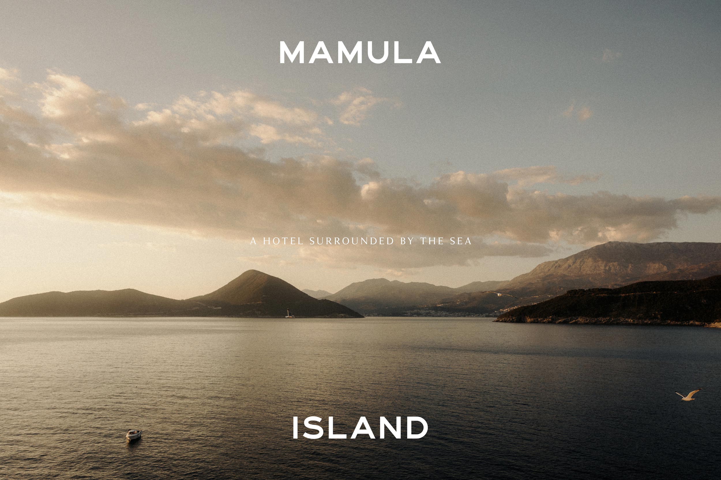
Mamula Island
Project
Brand Identity
Disciplines
Branding
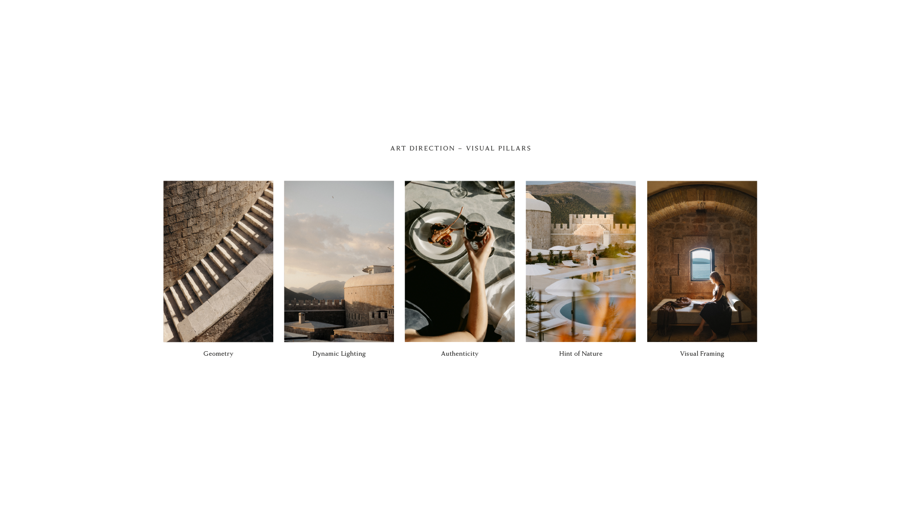
Art Direction
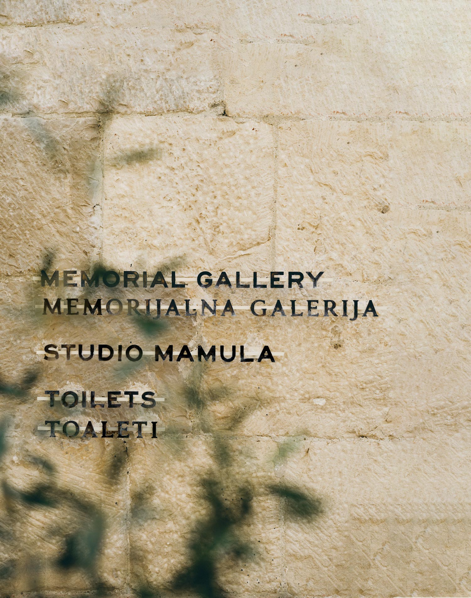
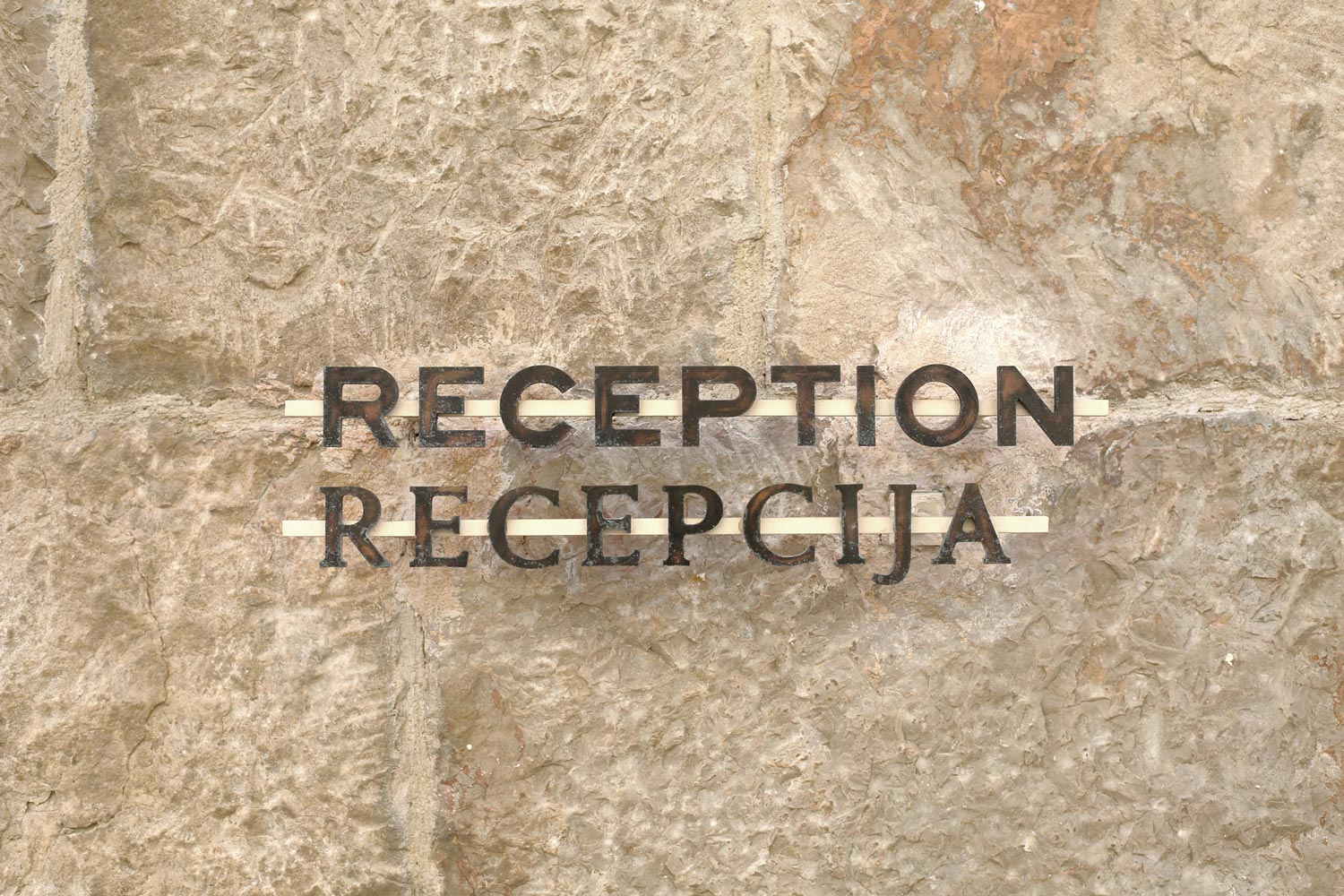
Signage
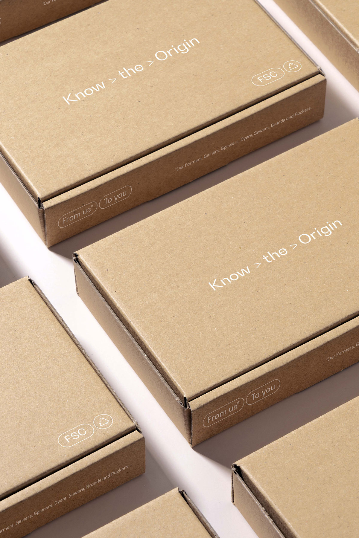
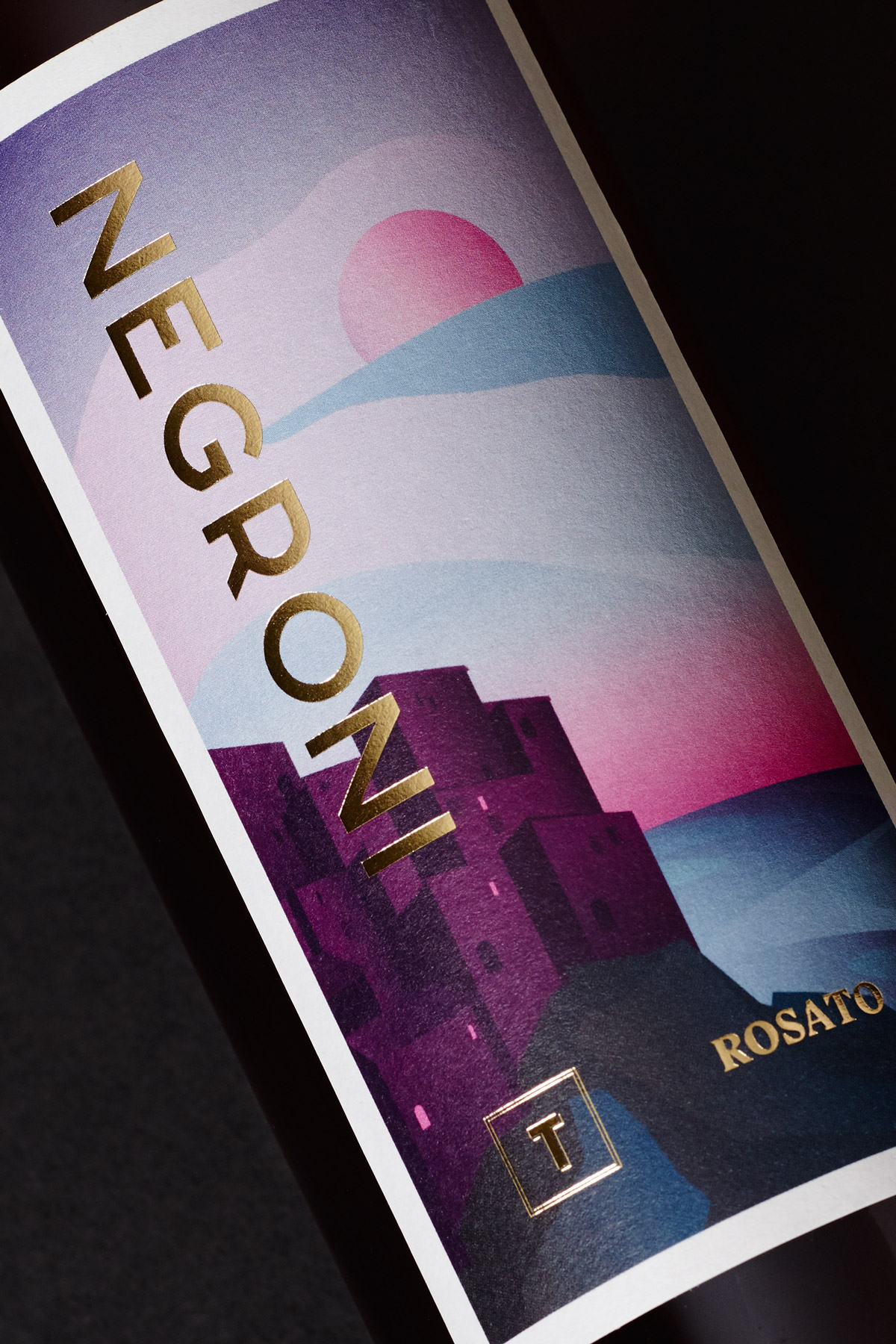
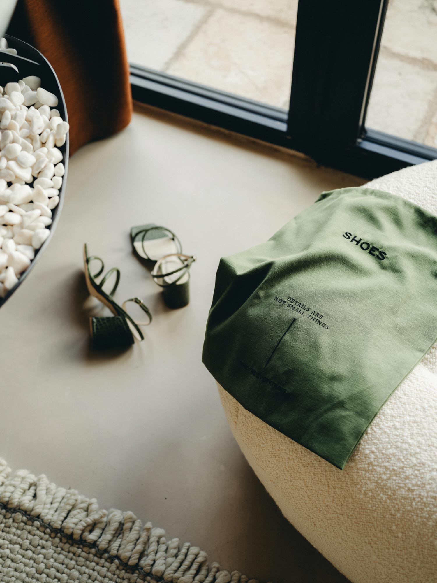
Packaging
Digital Design
Print Design
Social Media
Aerial Footage
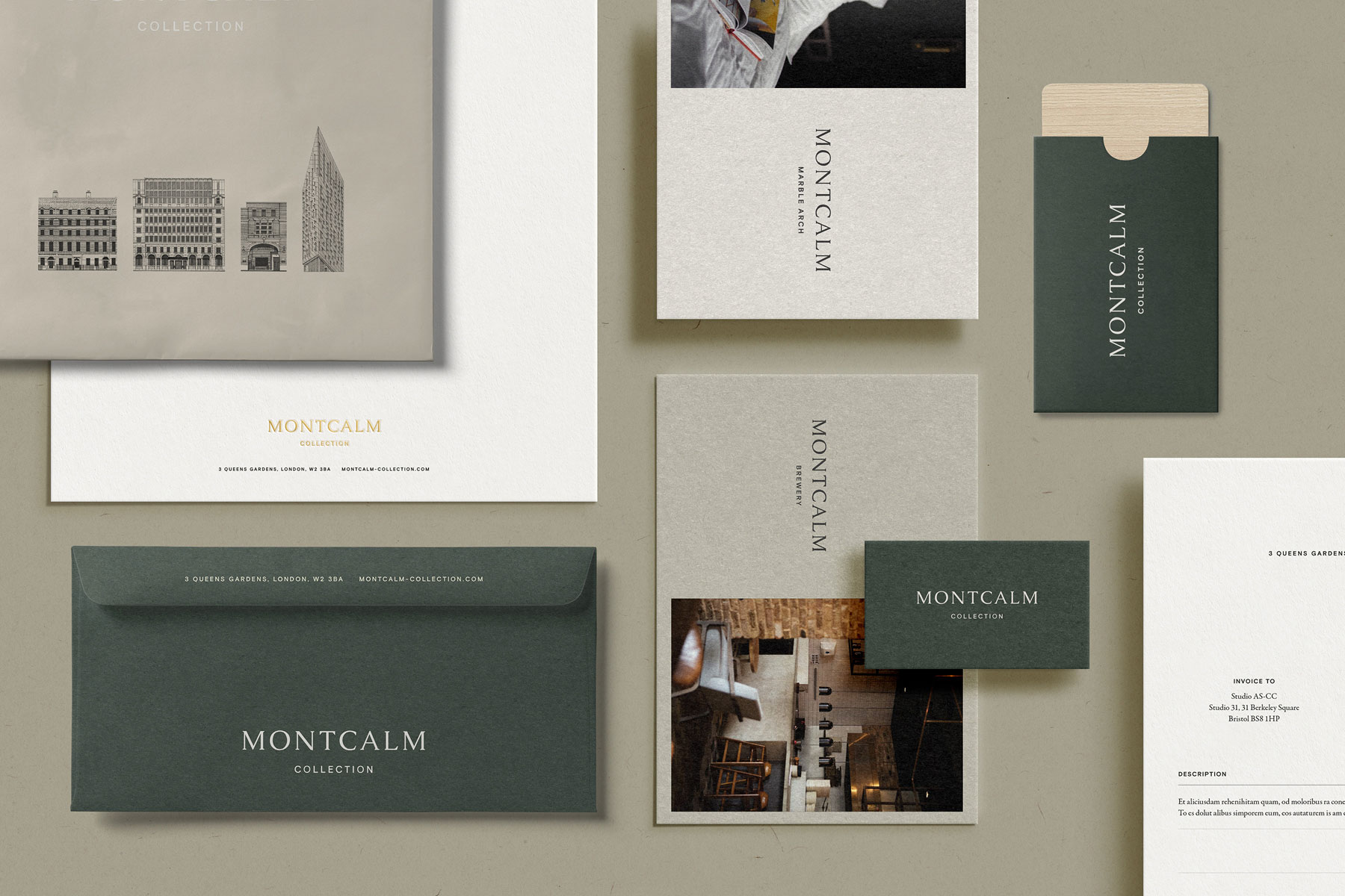
Project Description
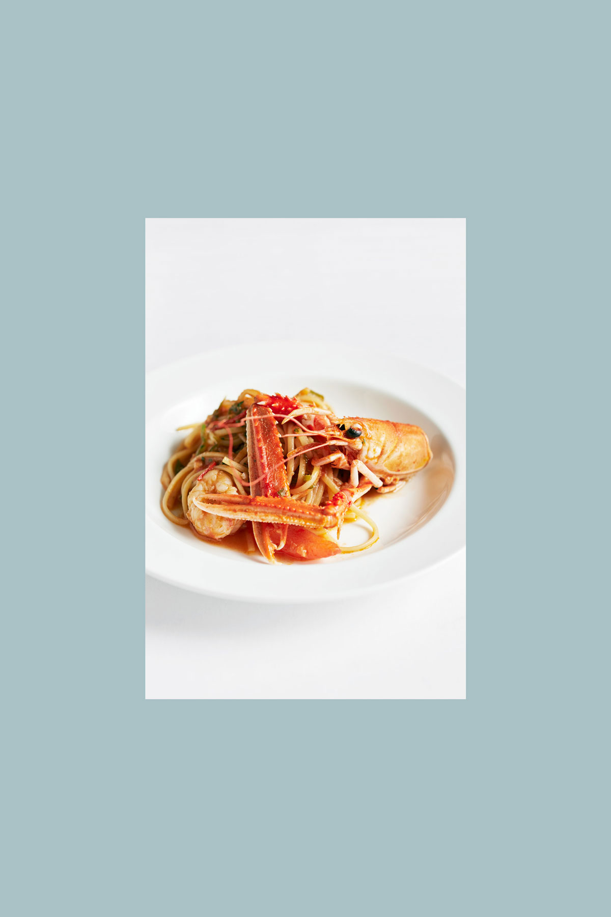
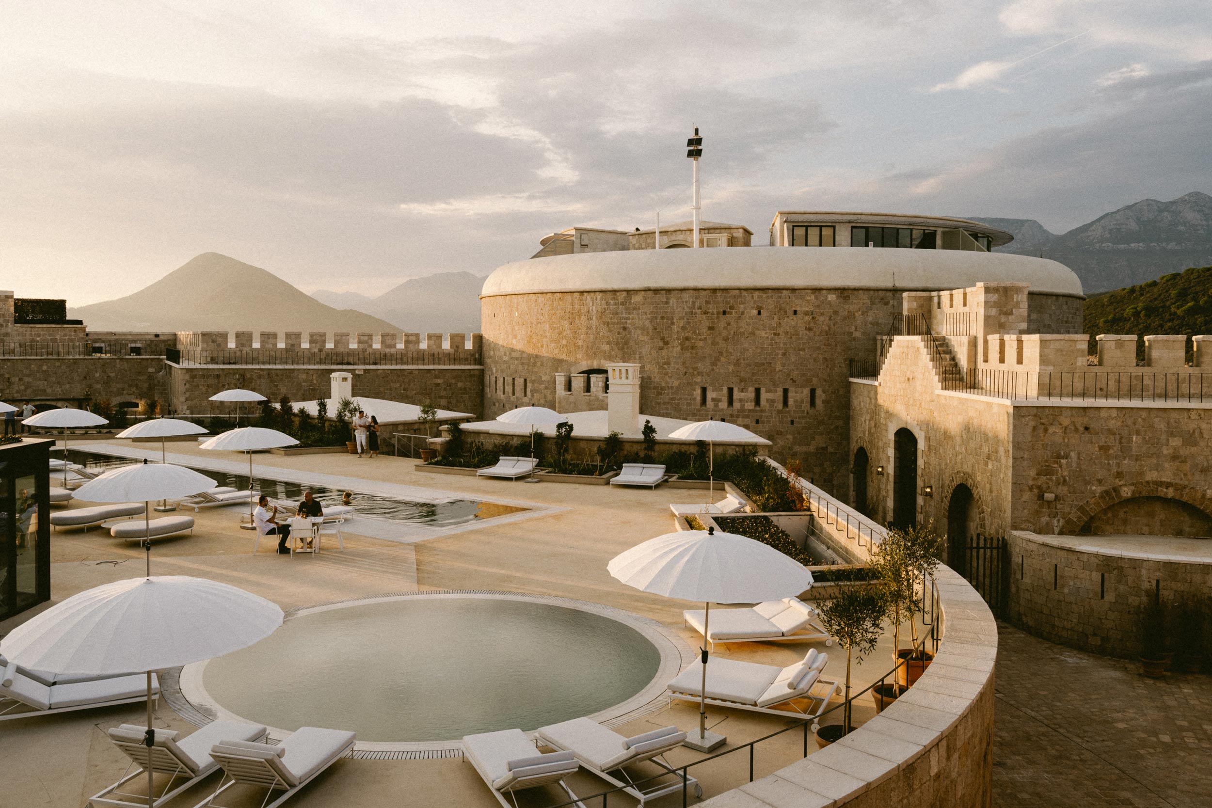
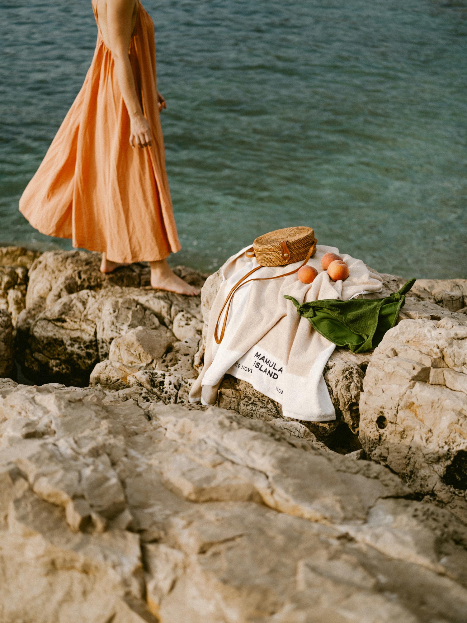
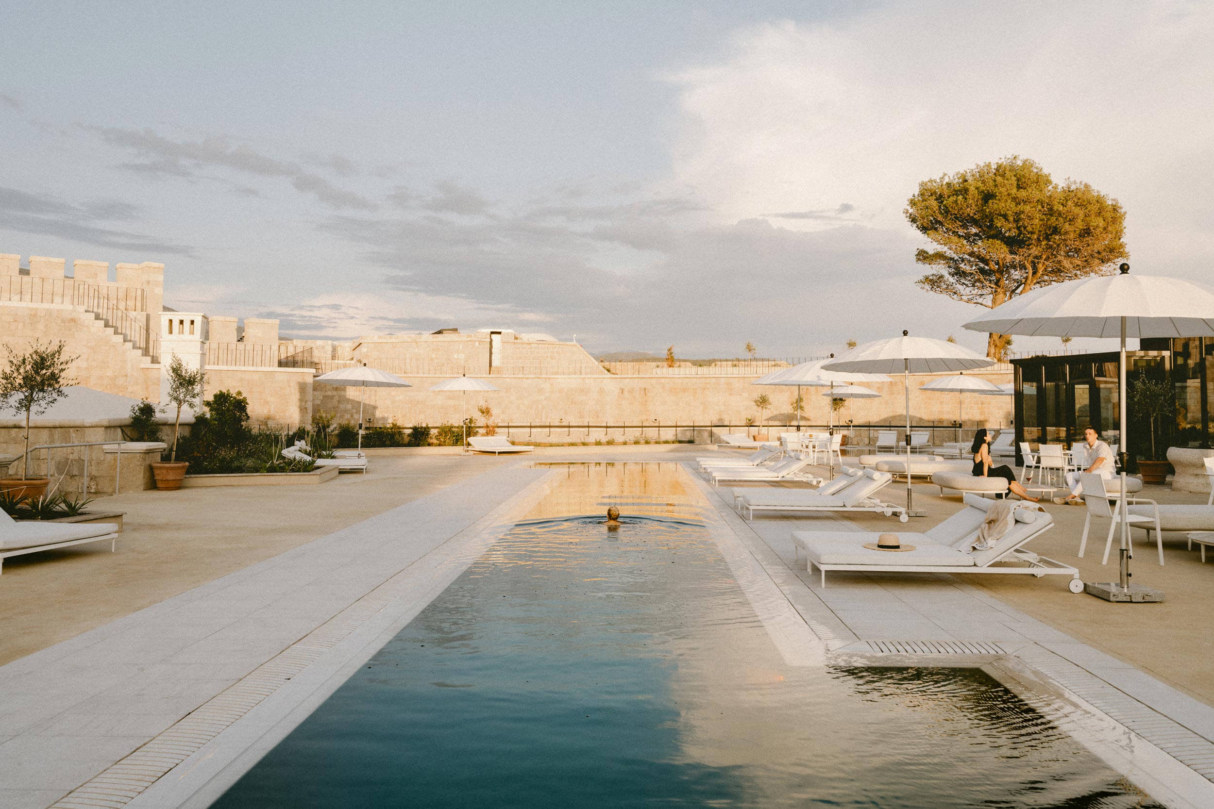
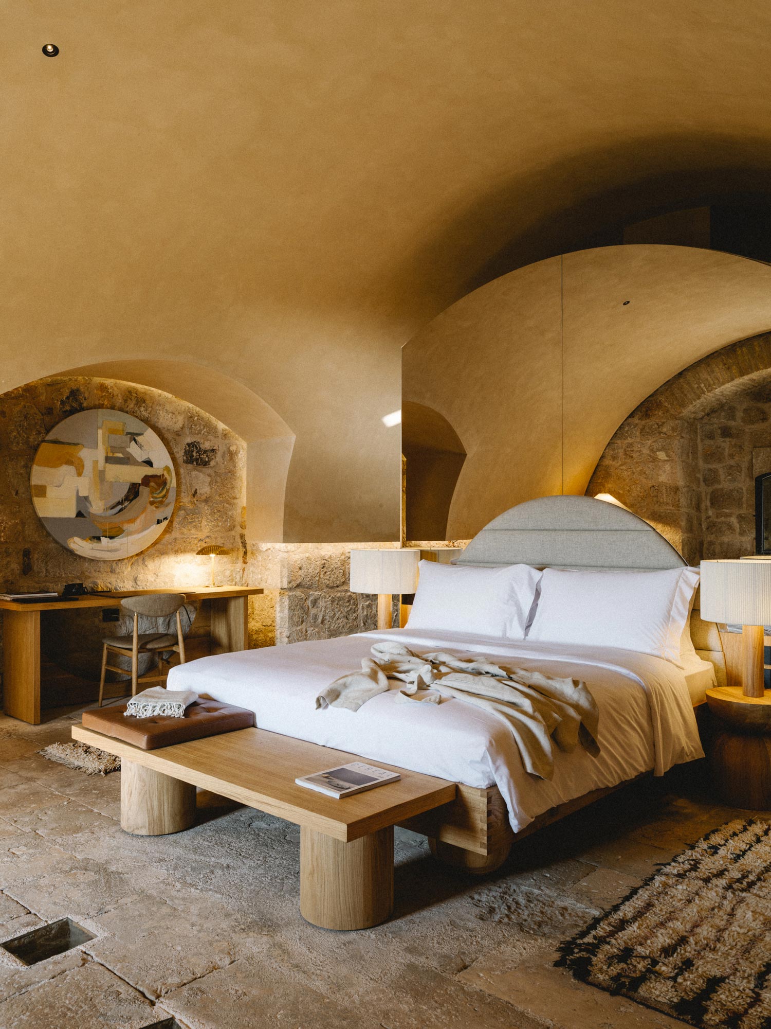
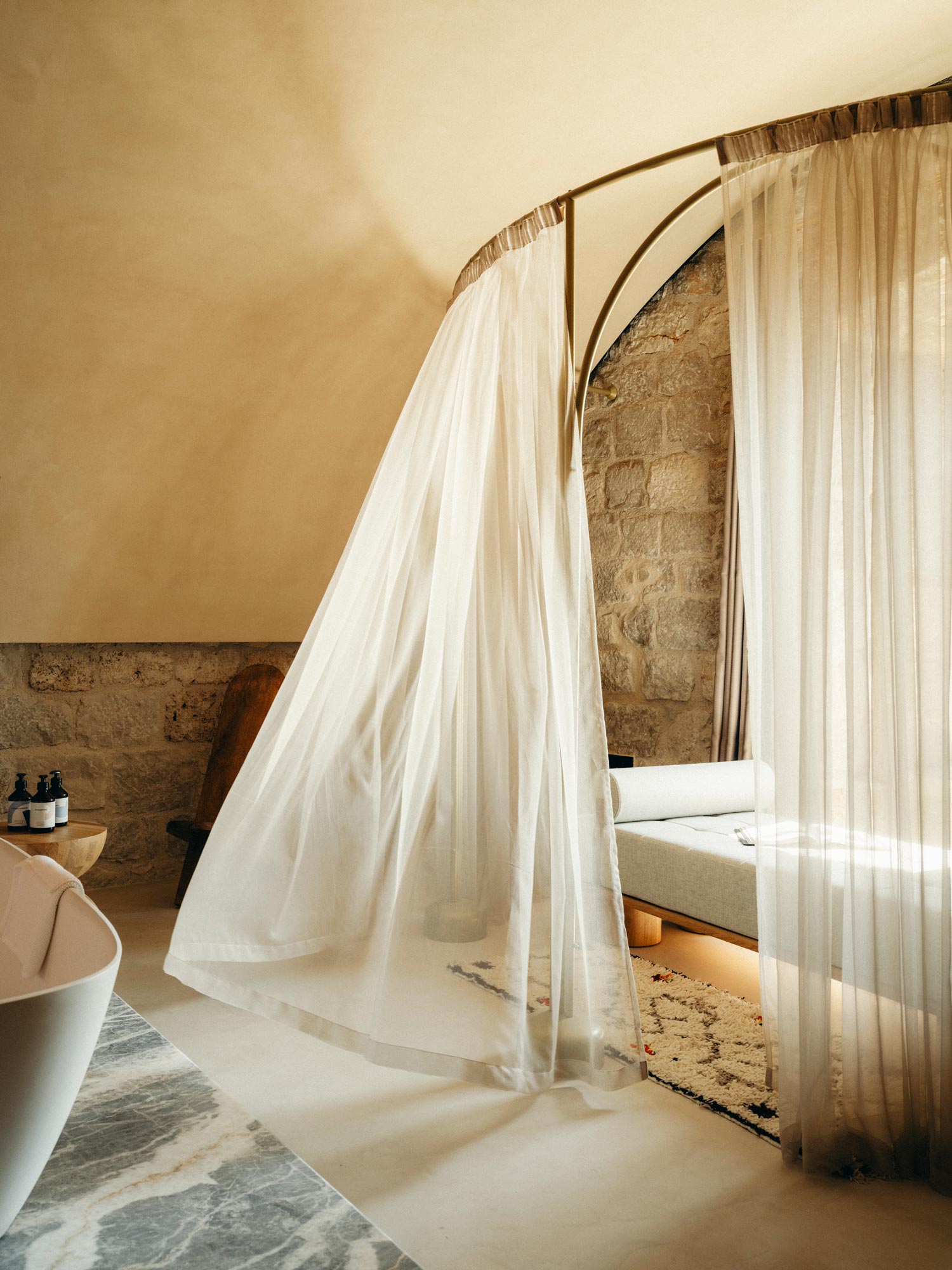
A hotel surrounded by the sea, that you see from afar. Off the coast of Montenegro, in Boka Bay, a unesco world heritage site in the Adriatic sea, this hotel is a carefully restored 19th century fort. The island hosts 32 rooms and suites, a holistic spa, a beach, 3 pools, 3 restaurants and 4 bars.
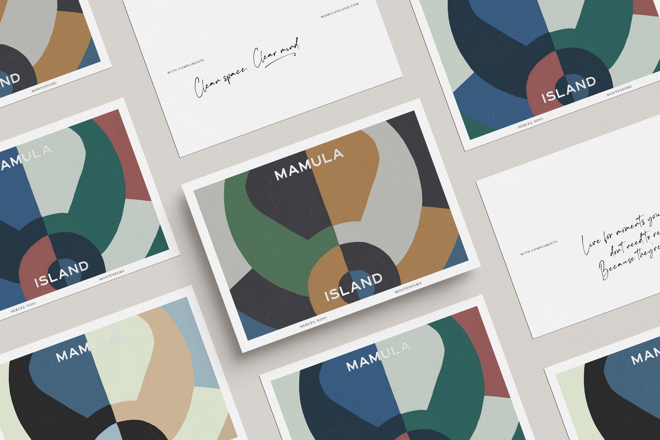
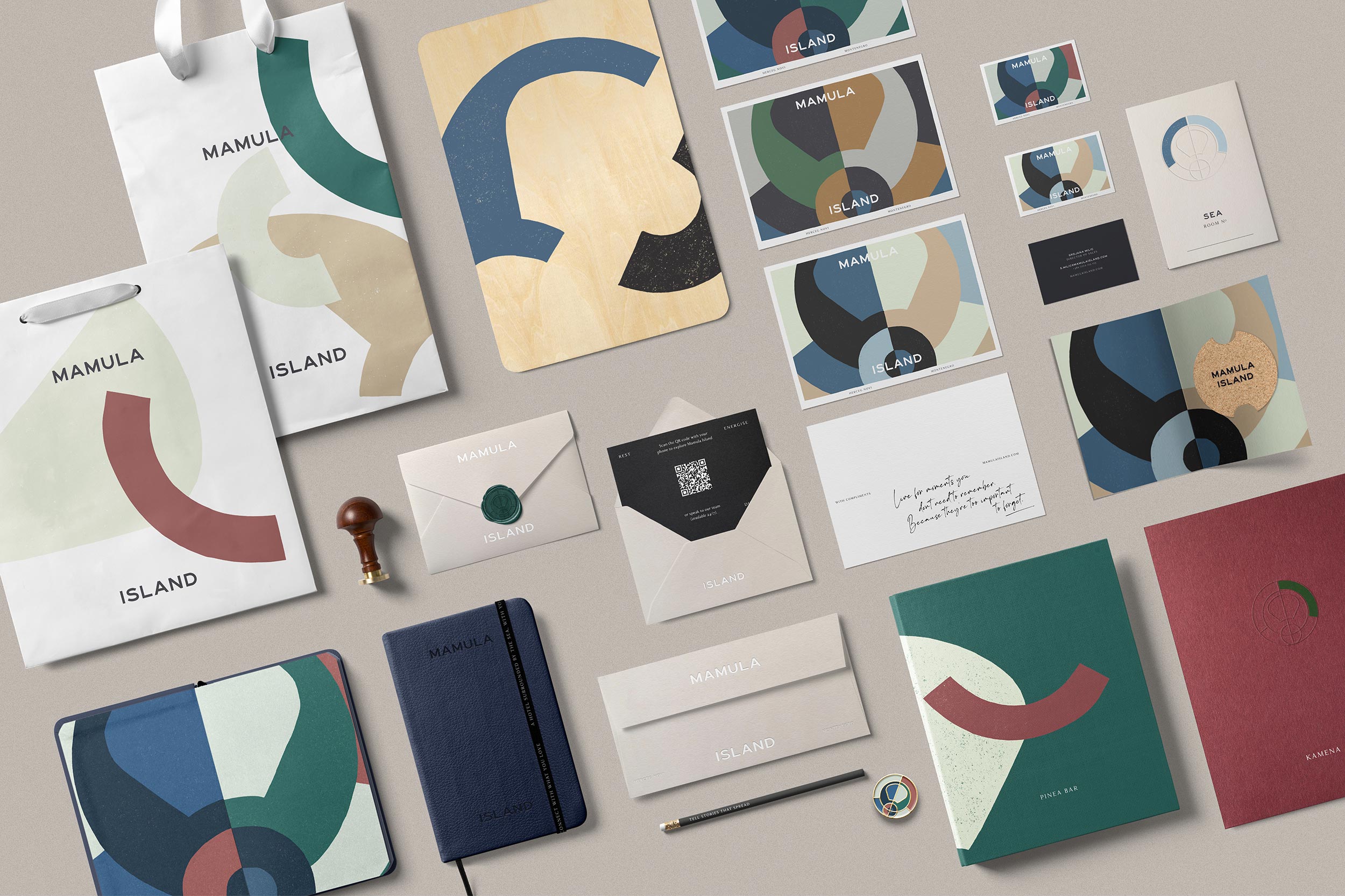
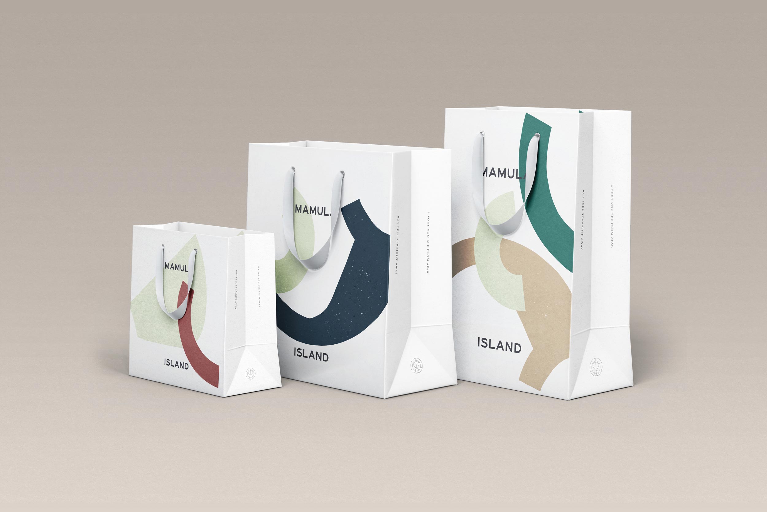
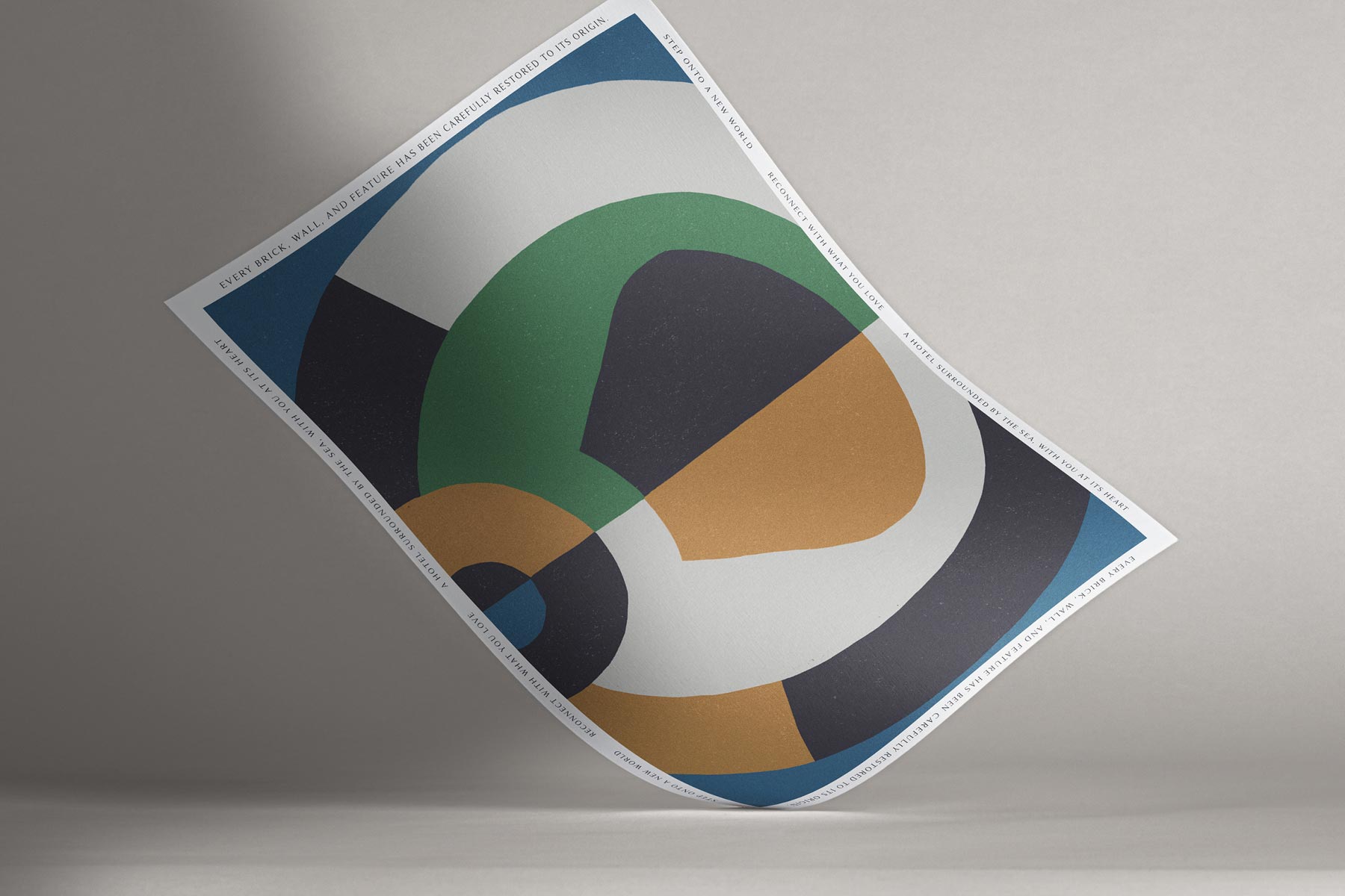
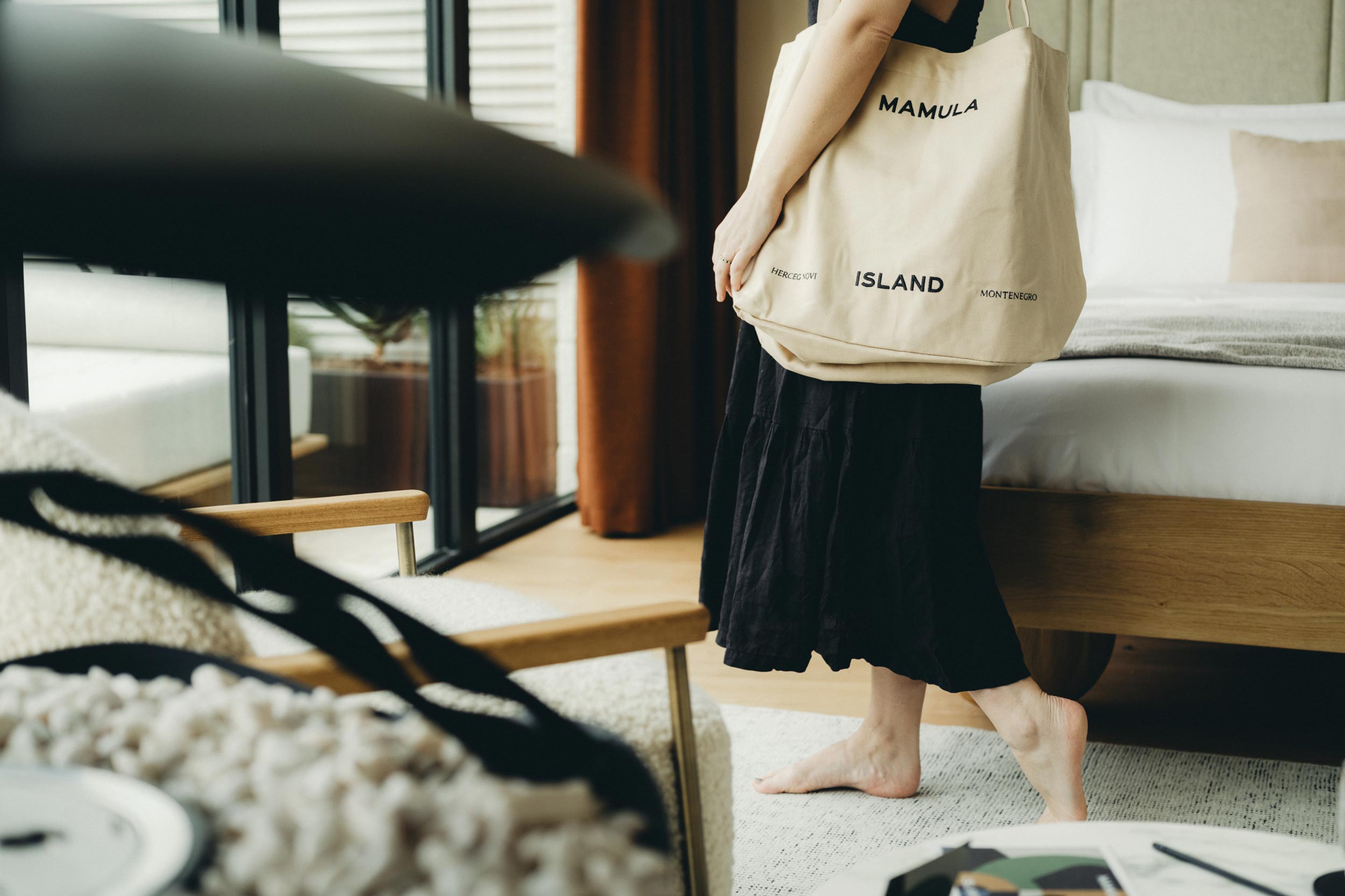
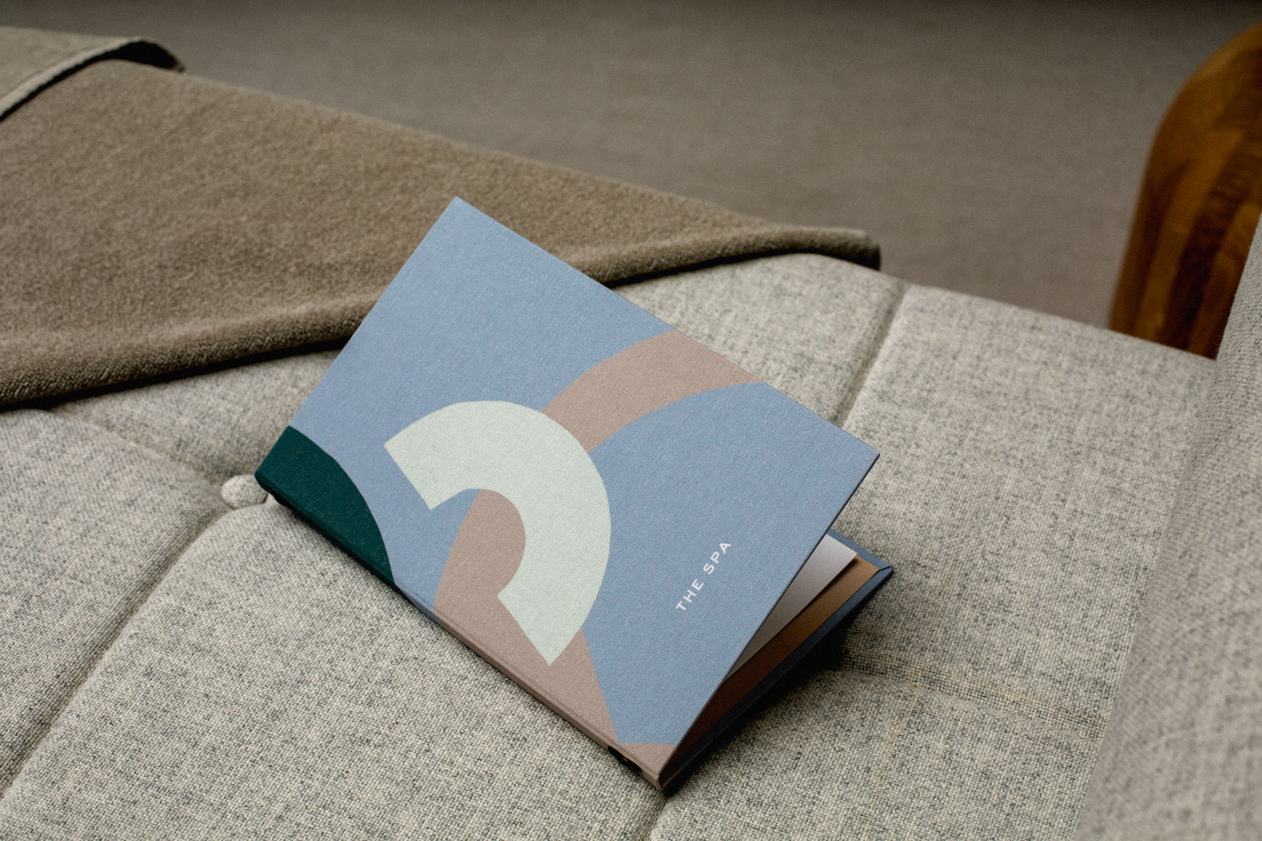
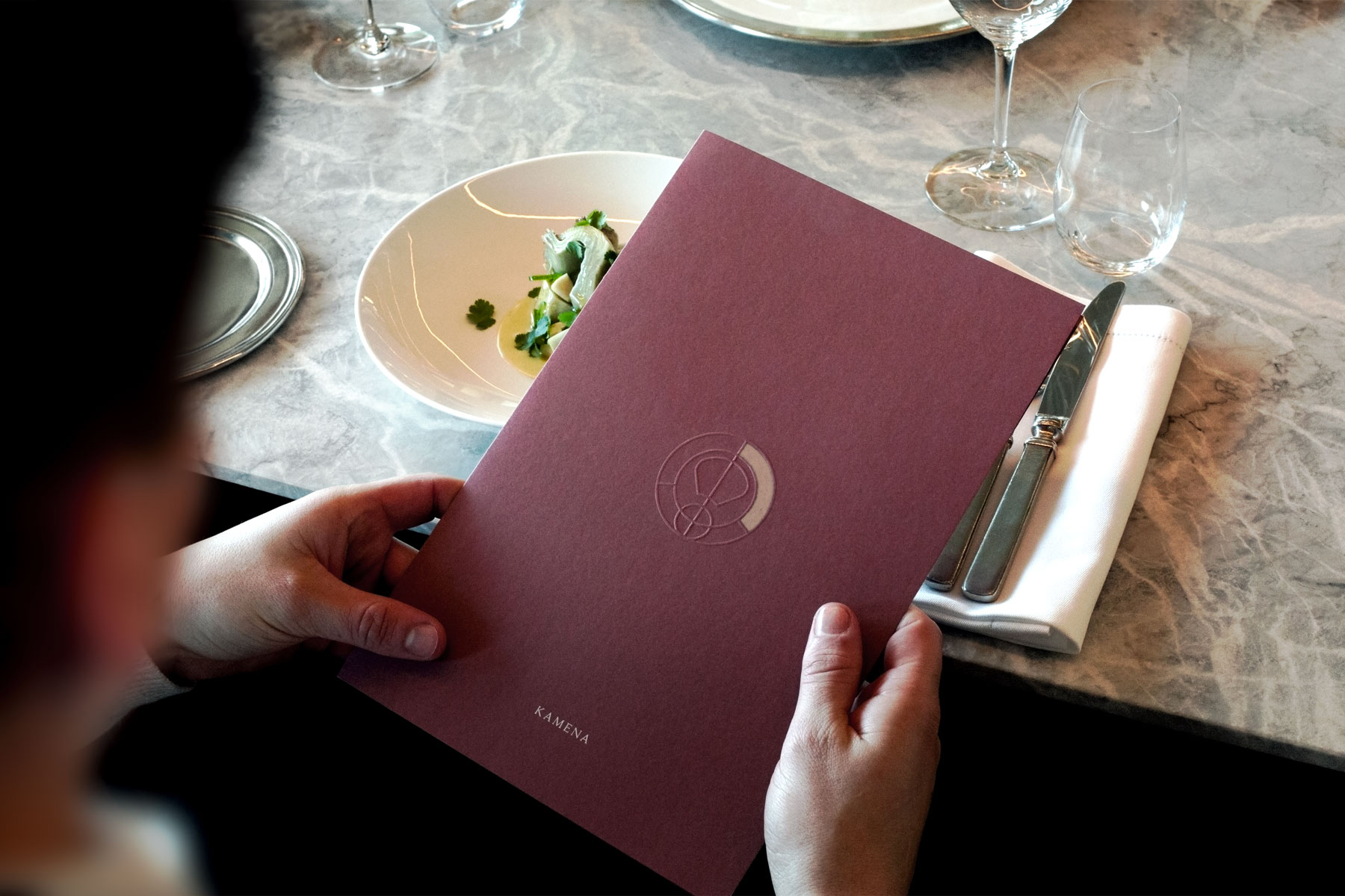
We created a brand grounded in symmetry and geometry, reflecting the historic structure which is formed of strong angles and curves. This sense of symmetry is realised through the brand icon which is based on the aerial geometry of the fort as well as through the use of typography in the wordmark, and within the layouts across the printed collateral.
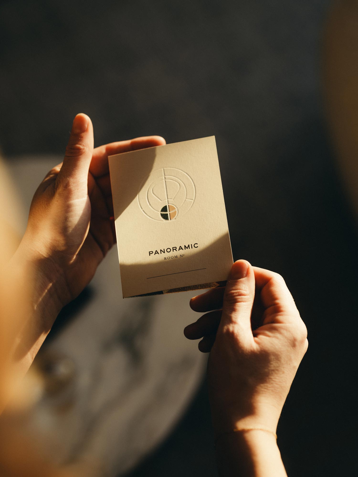
The icon and illustrations, whilst working as modernist art pieces, can also be disbanded to form a visual language from the negative shapes, for more playful executions. This iconography is also utilised as a functional wayfinding device across signage, menus, and room type selection online.


Project Description
A hotel surrounded by the sea, that you see from afar. Off the coast of Montenegro, in Boka Bay, a unesco world heritage site in the Adriatic sea, this hotel is a carefully restored 19th century fort. The island hosts 32 rooms and suites, a holistic spa, a beach, 3 pools, 3 restaurants and 4 bars.
We created a brand grounded in symmetry and geometry, reflecting the historic structure which is formed of strong angles and curves. This sense of symmetry is realised through the brand icon which is based on the aerial geometry of the fort as well as through the use of typography in the wordmark, and within the layouts across the printed collateral.
The icon and illustrations, whilst working as modernist art pieces, can also be disbanded to form a visual language from the negative shapes, for more playful executions. This iconography is also utilised as a functional wayfinding device across signage, menus, and room type selection online.